
5 Rules to Bounce Lettering
Now that you have learned how to brush letter you can take that to the next level and add a little bounce to that lettering.

Bounce lettering is a great way to give you lettering some flow and become uniquely your own lettering. Of course, though, you don’t want this to look sloppy. You want it to be clean and easy to read still. Have you ever seen that Pinterest post of a quote that someone lettered and it feels like a puzzle to read? Well that is what we are trying to avoid and here are some tips to help!
First things first!
Supplies- What do you need? Just anything to write with and to write on. You don’t need anything fancy to hand letter and for this tutorial I am going to be using a Crayola Broad Line Marker and HP Premium Choice Laserjet Paper. Another paper I would highly recommend, because it is also smooth and has gridlines for you to follow, is Rhodia Grid Paper. Since I am just using plain white paper I will be drawing in guidelines to follow and I would suggest, for practicing, you do the same. I drew 4 parallel lines about a half an inch apart from each other. If you want to know more about supplies check out my blog post on Brush Lettering. (Honestly you probably should read the brush lettering post before this one anyways if you are not familiar with hand lettering!)
Now for the fun stuff!
Let me show you the difference between regular lettering and bounce lettering.

As you can see on the LEFT is REGULAR Lettering and the RIGHT is BOUNCE Lettering.
The right is a little more playful, as the left is much more straight and uniform.
Let’s Learn Some Stuff! -> Guidelines!
To get a good understanding on how to move your letters around you need to have a good understanding of the guidelines on the page that you need to follow (this is where the Rhodia paper would be great but if you have plain white paper that is fine, just draw in the lines like I do for practice).

Here’s some terms for ya!
X-Height= The space in the middle of the waistline and baseline, the height of all your lower case letters.
Ascender Line= The top line that your letters that extend upward touch.
Descender Line= The bottom line that your letters that extend downward touch.
Waistline= The top of the lower case letters or the top of the bas of the letter. (ie. the top of the oval on a lowercase “d” will touch this line)
Baseline= The main line you write on or follow. This is the line that all your letters start on and the bottom of the letter or base of your letter touches. (ie. the bottom of the oval on a lower case “p” will touch this line)
Now that you know about the guidelines lets move on to those 5 Rules I’ve been telling you about!
FIRST! There technically are NO RULES to bounce lettering so HAVE FUN WITH IT! These are just some rules/things to consider (that are meant to be broken at times) that will help you have easier to read, yet fun and whimsical lettering.
1. Don’t Forget Your Basic Hand-Lettering Strokes
Remember in the brush lettering blog post about thin and thick strokes, picking up your pen, writing slowly… well those all apply here. You aren’t writing cursive so remember these techniques are still important.

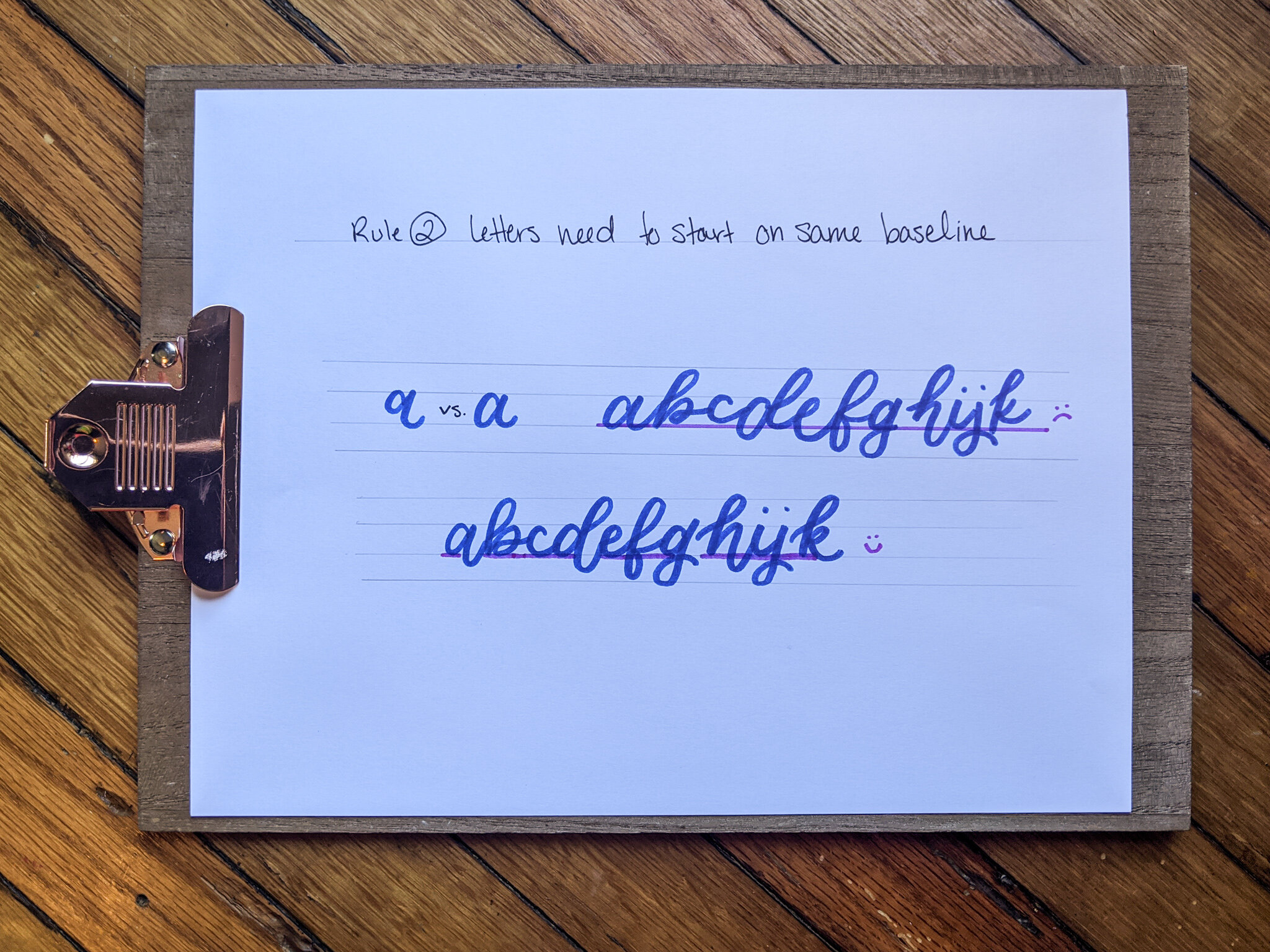
2. Your Letters ALL Need to Start on the Same Baseline.
The bounce is in parts of the letter, not the whole letter itself. You may think that to bounce your lettering you move the “a” up and the “b” down, but actually you are extending the tail or bumping up one of the humps on the “m”. SO keep your letters still on the baseline. You can definitely tweak it at times but it gets messy when you do that with every letter.
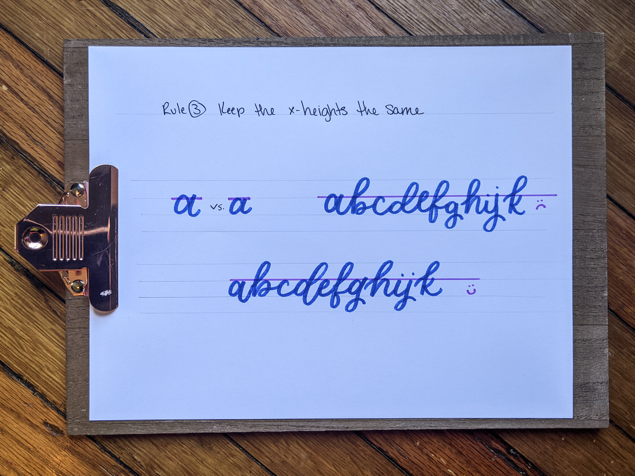
3. Keep Your X-Heights the Same
Now this kind of goes with the last one. You want to keep your ovals of letters (ie: “a” “b” “d”,etc) at the same same x-height. This just makes it easier to read. Of course play around, maybe extend the top of the stem of your “g” above the waistline and experiment with things like that. The more you play the more you come across something that works and looks good. But as a rule of thumb, don’t go crazy with changing up the heights of your letters play more with extensions of tails and stems of letters.
4. Keep your bounce at a reasonable height.
This is definitely something to play with, so don’t think that all extensions and heights have to be the same. Have fun with it. BUT don’t go crazy and extend past the ascending and descending lines, that is when things start to look a funky or unproportional. You want others to be able to read what you are writing and this could lead into some confusion, where some letters may start to look like other letters.

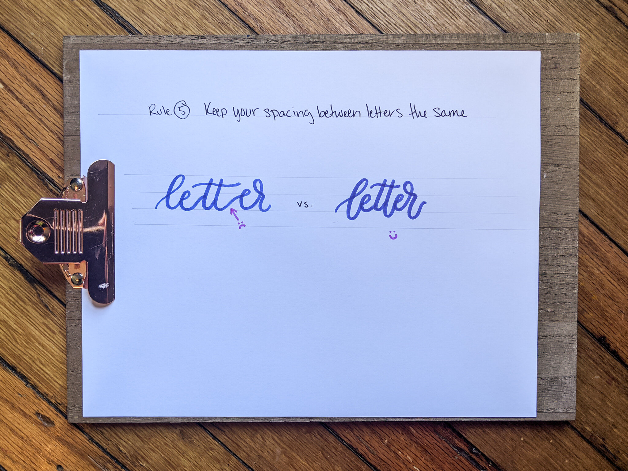
5. Keep the spacing between letters the same.
When you have letters that are spaced far apart and letters that are cramped, it starts to look a little off. Keeping similar spacing (even when writing a sentence) will help the word look cohesive and easy for the eye to look at.
Now How to Get Started!

Hand-letter the word you want to write.
Look at the word and consider what parts of the letters you want to extend below the baseline. Circle those areas to remember. I typically like to extend tails or where the letter does a natural dip. There’s no rules in how many you make do that or you only do ever other one, so play around with those extensions and see what you like best.
Write the word with the extensions below the baseline. Look at it and consider if you like them, if there are too many, do you want to do more, etc. This is your opportunity to play and see what you like!
Now circle the areas of the word you would like to extend above the waistline. I personally enjoy extending the loops of my “o” and “r” up and I like to look at the letters that have a hump, such as the “h”, “m”, or “n” and extend those as well.
Write your word with both the extension below the baseline and above the waistline. What do you think of it? Do you need more? Too Much? Play around and write it differently and see how you like the different variations.
LAST THING!
Go play around with a few words (if you have never written minimum it is now the time because it is such a fun word to write) or write your name in bounce lettering. Then post it in a story or on your instagram and tag me in it! I definitely want to see what you are creating! HAVE FUN!

